Windows 8 Developer Preview Released
14 Sep 2011Microsoft has now released the developers preview for Windows 8, which includes -
- A 64-bit Windows Developer Preview
- Windows SDK for Metro style apps
- Microsoft Visual Studio 11 Express for Windows Developer Preview
- 28 Metro style applications including the BUILD Conference app
It’s available here.
Although I haven’t personally installed the release, here are a couple of screenshots from a user running it in a Virtual Machine.
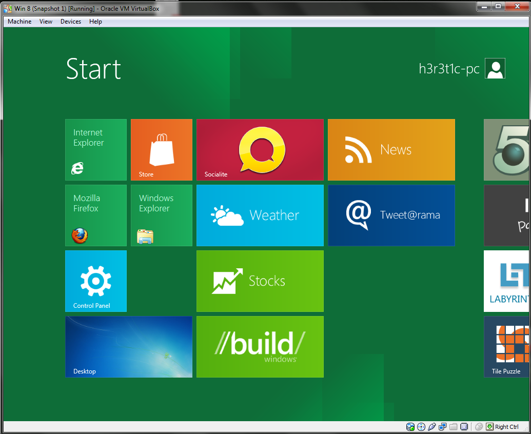
This shows the new ‘Metro’ UI in Windows 8. It consists of a series of tiles and widgets that link to the most common applications. I can’t really see anyone using this on a desktop computer, but I suppose it’s meant to be for mobile devices with touchscreens, which will benefit hugely from the large icons.
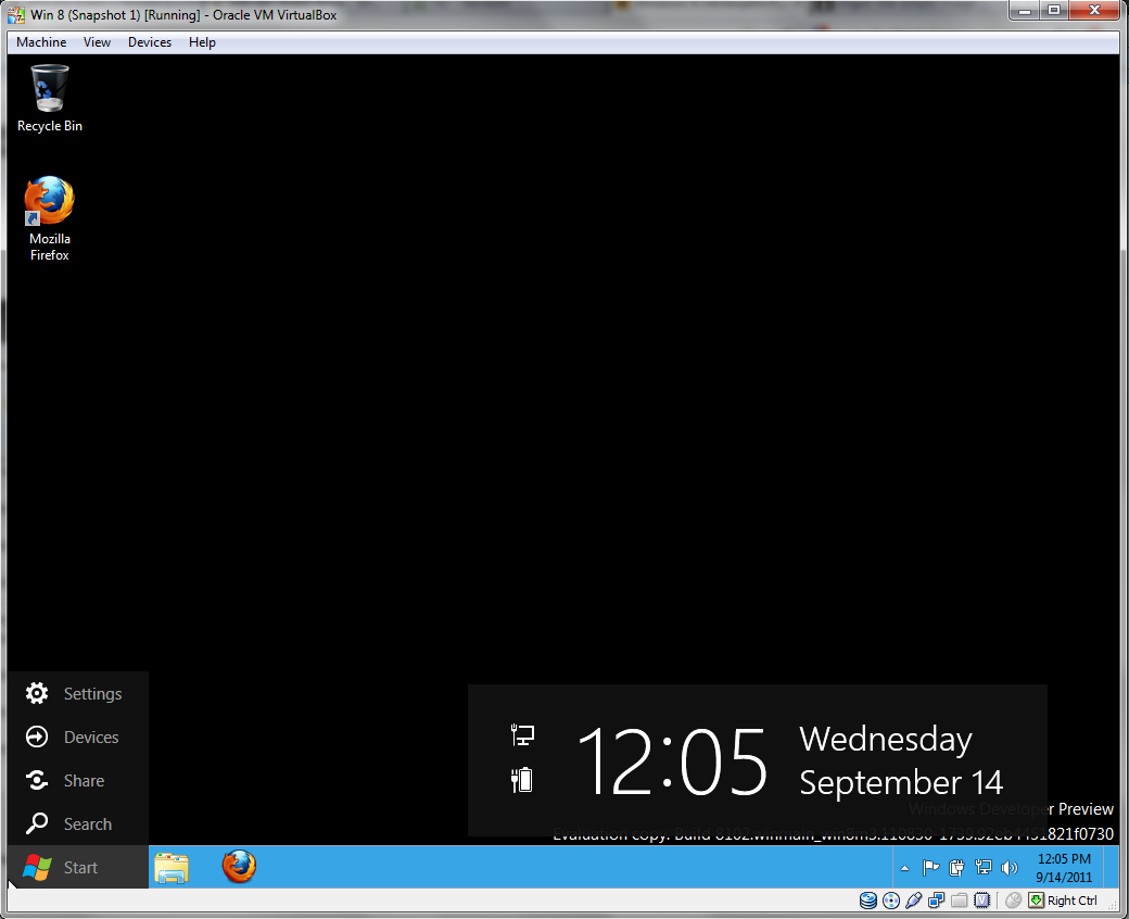
Here is the new desktop and start menu in the developer release. Although most of the desktop is similar to that of Windows 7, huge changes can be seen in the new start menu which has been completely revamped to fit in with the new Metro style.
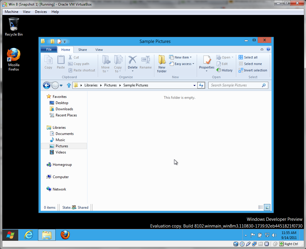
One of the main changes in the new release is the new Ribbon in Windows Explorer. For more basic skilled users this could be a real time saver, as it stops people from trawling through the edit menu in order to find ‘Copy’. However on the other hand, on smaller resolutions the Ribbon can take up a lot of real estate, and won’t leave much room for the actual files to be displayed. I can see most advanced users instantly hiding the Ribbon, as most of it’s features can be accomplished with simple keyboard shortcuts.
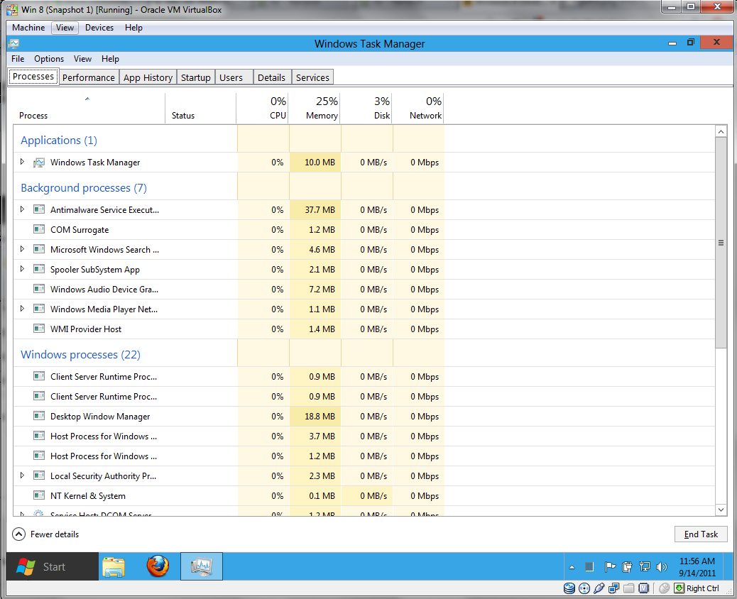
The task manager has also been given a much needed face lift. It’s now much more graphic, and offers the user more information than in previous versions. This will also apparently be a window that many users will see, as Microsoft have recently said that most people use the task manager on a day to day basis to ‘kill’ programs. This doesn’t really say much for the developers.
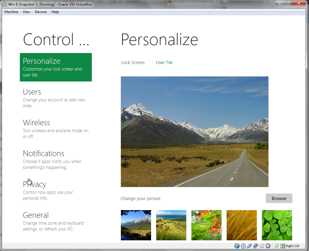
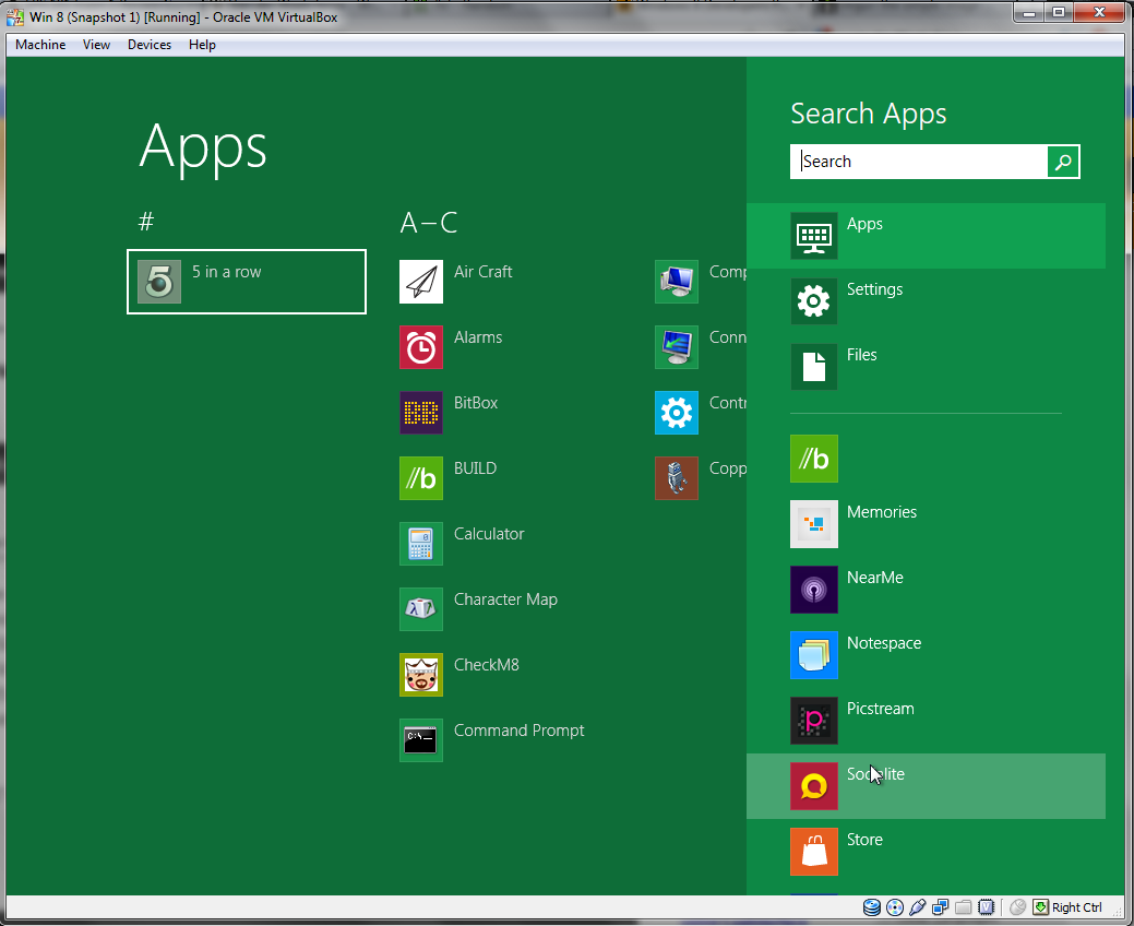
Finally there is the new Metro Control Panel and a possible Metro equivalent to ‘All Programs’. I hope that Microsoft still include the old versions however, as I can see trying to navigate the control panel on a desktop computer taking twice as long as it should do.
Of course this is a very early build of Windows 8, but shows a taster of what’s to come. I find it surprising that Microsoft have made such large changes from Windows 7. Obviously Microsoft are trying to integrate the new release with Windows Phone devices, and Metro will look and feel great on a touchscreen device, but I don’t really think that it offers any use whatsoever to the majority of users sitting at their desks. Plus considering that Microsoft’s clients are mostly corporate, I can’t see the new changes being that popular with them. It will probably decrease productivity and will confuse many users, especially considering that many businesses have only just made the leap from Windows XP to Windows 7, and from Office 2003 to 2010. The leap has just been made at my college, but not without major problems. Many have had problems using Libraries, and the whole network has been down for hours at a time. Of course the problems will be fixed soon, but it doesn’t bode well for Windows 8 considering that it took the best part 8 years to upgrade to Windows 7.
Expect to see a lot more about the new release in the near future.